Lesson 7 of 10 · 2 min
Charts
Build and save a breakdown of a KPI.
A thousand rows is not an answer. Grouped by customer, it might be.
The Charts tab holds saved breakdowns, each on its own named tab, so a KPI can carry several standing views that anyone opening it will find.
A chart is defined by four settings. Primary attribute is the field being measured. Primary operator is how it aggregates — Sum and the rest. Secondary attribute and Grouping decide how the result is split.
Not every field can be grouped on: where a field has too many distinct values, the product excludes it rather than drawing an unreadable chart.
A Full-sized chart toggle expands the view, and each saved chart can be deleted from its own tab.
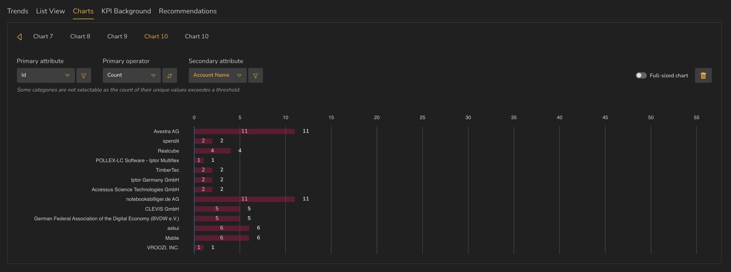
- 1Named chart tabs, with arrows for more
- 2Primary attribute, with its own filter
- 3Primary operator — here, Count
- 4Secondary attribute — what the result is split by
- 5The note about fields with too many unique values
- 6Full-sized chart toggle and delete
ValueWorks 2026.08
Takeaways
Charts are saved and named, so a KPI carries standing breakdowns.
Four settings define one: primary attribute, operator, secondary attribute, grouping.
Fields with too many distinct values can't be grouped on.
Surfaces covered
- Reporting
Micro-check
Two quick questions
Practice only — nothing here is scored or recorded.
1. A field you want to group by isn't offered. Why most likely?
2. You build a useful breakdown. What happens to it?