Lesson 2 of 6 · 3 min
Reading a KPI tile
Read any tile without help.
Each tile carries five separate pieces of information, and four of them are easy to miss.
The name sits top left. The current value is the large figure below it, with its unit as a smaller suffix — k , M , k€ , M€ , % . Beside the value, a triangle and percentage give the trend.
Beneath that, a bar chart shows recent months. How many bars appear depends on the tile’s size, which is set in edit mode.
Two reference lines can cross each bar: a purple line for last year and a white line for plan . The Last Year and Planning labels at the top right are a legend, not buttons — each is underlined in the colour of its line. The lines appear on their own when the tile is large enough and the KPI has those values; there is nothing to click.
The number above each bar is that month’s actual value. Its colour compares that actual against plan, taking the KPI’s direction of valuation into account: green where the actual is favourable against plan, red where it is unfavourable, and plain white where there is no plan value to compare with.
The three-dot menu offers Remove from favorites , then either Review KPI or Review / Edit custom KPI depending on whether the KPI is standard or custom. See related KPIs appears only where related KPIs exist.
A dash means no data for the period — absent, not zero.
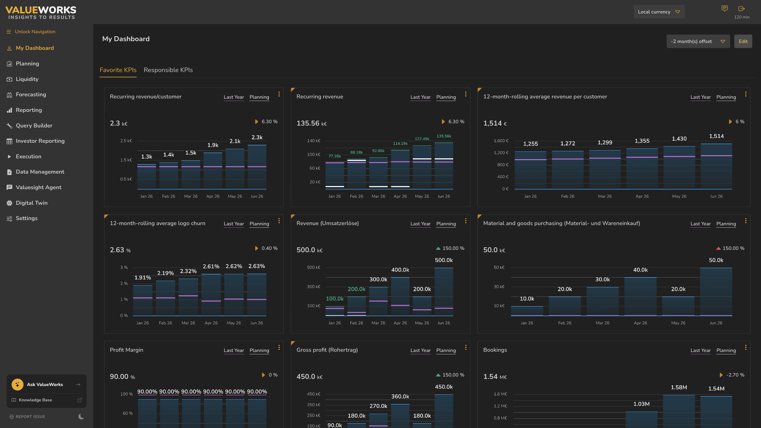
- 1Name
- 2Last Year / Planning legend — underlined in each line’s colour
- 3Current value and unit
- 4Trend triangle and percentage
- 5White plan line
- 6Purple last-year line
- 7Actual for the month, coloured against plan
- 8Three-dot menu
ValueWorks 2026.08
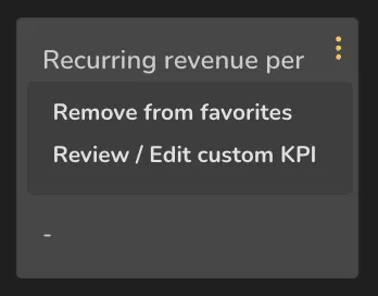
- 1Remove from favorites
- 2Review / Edit custom KPI — a standard KPI reads Review KPI instead
ValueWorks 2026.08
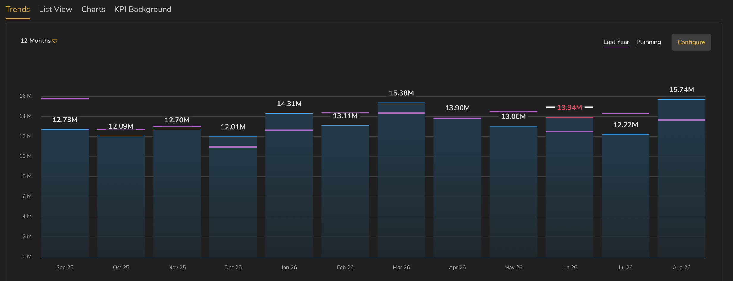
- 1White values — no plan for that month, nothing to compare
- 2Red value — a plan exists and the actual fell short of it
- 3Purple last-year lines
ValueWorks 2026.08
Try this in your tenant — find a tile where one month’s number is a different colour from its neighbours, and work out why.
Takeaways
Two reference lines: white is plan, purple is last year . The labels are a legend, not buttons — the lines appear when the tile is big enough and the values exist.
The number above each bar is that month’s actual . Its colour is the comparison against plan.
The three-dot menu differs by KPI type: standard KPIs offer Review KPI , custom ones Review / Edit custom KPI .
Surfaces covered
- Name
- Value and unit
- Trend triangle
- Bar chart
- White plan line, purple last-year line
- Last Year / Planning legend, not buttons
- Number above bar = that month's actual, coloured against plan
- Three-dot menu
Micro-check
Two quick questions
Practice only — nothing here is scored or recorded.
1. Most of the monthly values here are printed in plain white. What does white tell you?
2. A tile shows no purple last-year line, though the KPI has last-year data. Why?