Lesson 3 of 6 · 3 min
The four indicators
Say what each indicator means and what to do about it.
The most expensive mistake on this screen is putting a number into a board pack that the dashboard already warned you about.
The trend triangle combines two things. Its shape shows which way the value moved. Its colour shows whether that movement is good or bad, which depends on the KPI’s direction of valuation rather than on the direction of the arrow. For revenue, where higher is better, a downward move is red. For a cost KPI, where lower is better, the same downward move is green.
The threshold is ten percent. Any change smaller than that displays orange and points right — treat it as flat, whichever way it went. Only changes beyond ten percent are coloured green or red.
An orange triangle in the top-left corner means the KPI has related KPIs beneath it.
A red exclamation mark beside the value means the underlying data is out of date. The figure on screen is stale. Check its source and responsible person before using it anywhere.
Related OKRs appear beneath tiles on the Responsible KPIs tab.
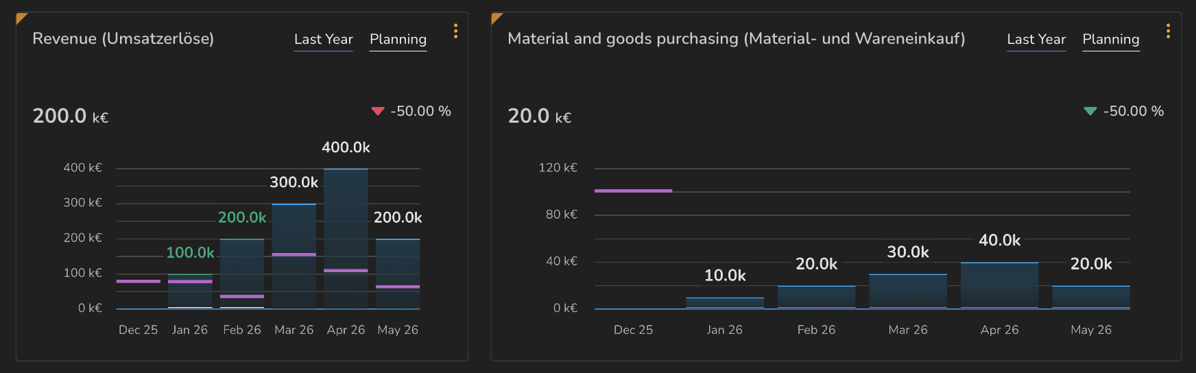
- 1Red downward triangle — revenue falling is unfavourable
- 2Green downward triangle — purchasing costs falling is favourable
ValueWorks 2026.08
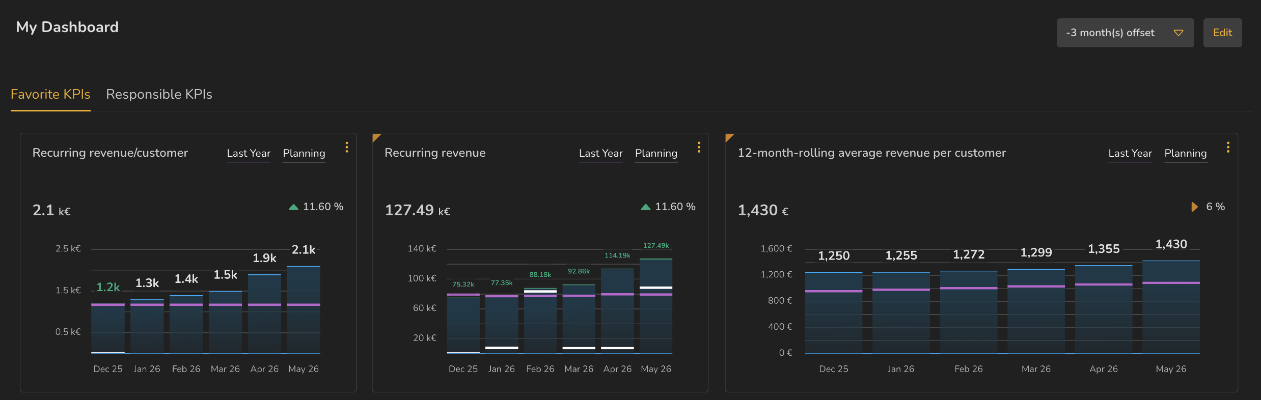
- 111.60% — beyond the threshold, so coloured green
- 26% — inside the threshold, so orange and pointing right
ValueWorks 2026.08
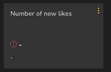
- 1Red exclamation mark
- 2Dashes where the value would be
ValueWorks 2026.08
Try this in your tenant — find any tile on your dashboard with a red exclamation mark and work out who is responsible for it.
Takeaways
Triangle shape is direction of movement; colour is whether that movement is good for this KPI.
Under ten percent shows orange and points right — flat, whichever way it moved.
Red exclamation means stale data. Don’t put that number in front of anyone until you’ve checked it.
Surfaces covered
- Trend triangle: shape = direction, colour = favourable or not per direction of valuation, orange under ±10%
- Orange corner = related KPIs
- Red exclamation = stale data
- Related OKRs
Micro-check
Two quick questions
Practice only — nothing here is scored or recorded.
1. Revenue is up 7% on last month. How does the trend triangle appear?
2. Cost of goods sold has fallen 30% this month. What colour is its trend triangle, and why?